
Building responsive Canvas Apps (Power Apps) is one of the tricky parts of Power Apps. However, there are a few new options available in order to create really responsive Power Apps. So let’s jump right in and check out the new features!
Tutorial to build responsive Canvas Apps
Building responsive Canvas Apps (Power Apps) is one of the tricky parts of Power Apps. However, there are a few new options available in order to create really responsive Power Apps. So let’s jump right in and check out the new features!
Create a new Canvas App
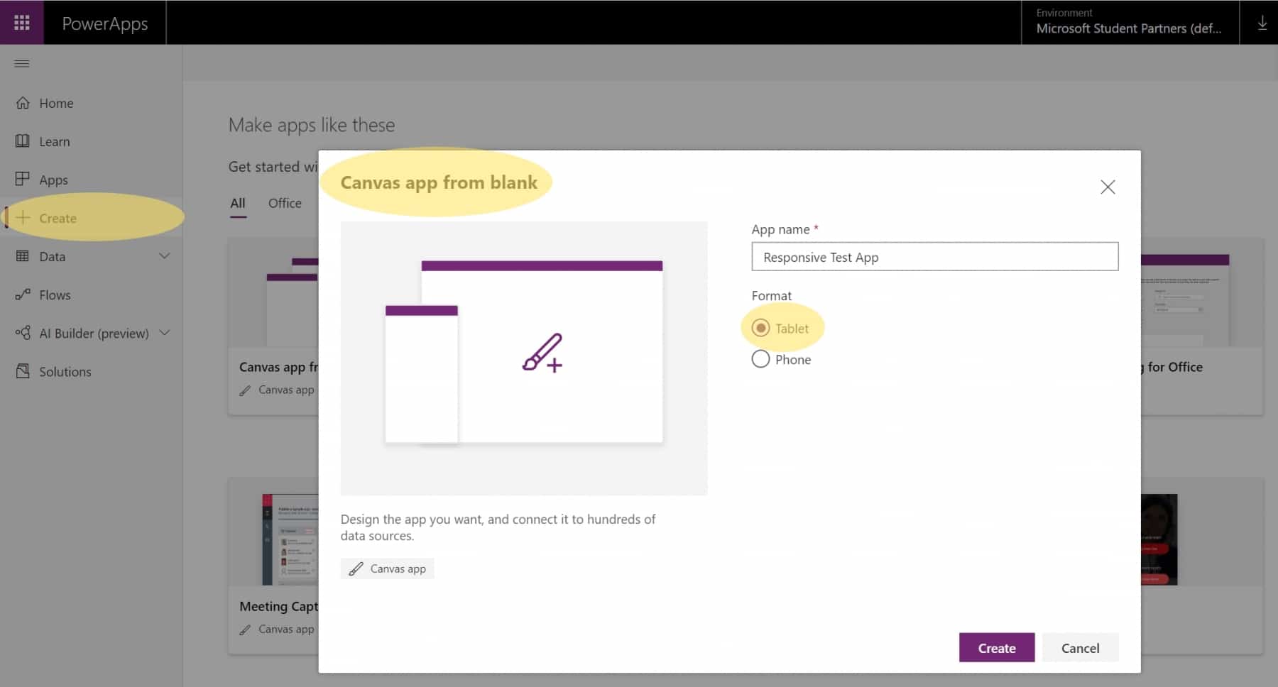
Let’s start with creating a new Power App from the Power Apps Maker Portal: In this case, we choose a Canvas App, of course. Please choose the tablet layout to have more space to edit the Canvas App and to have all options available.
Turn off „Scale to fit“
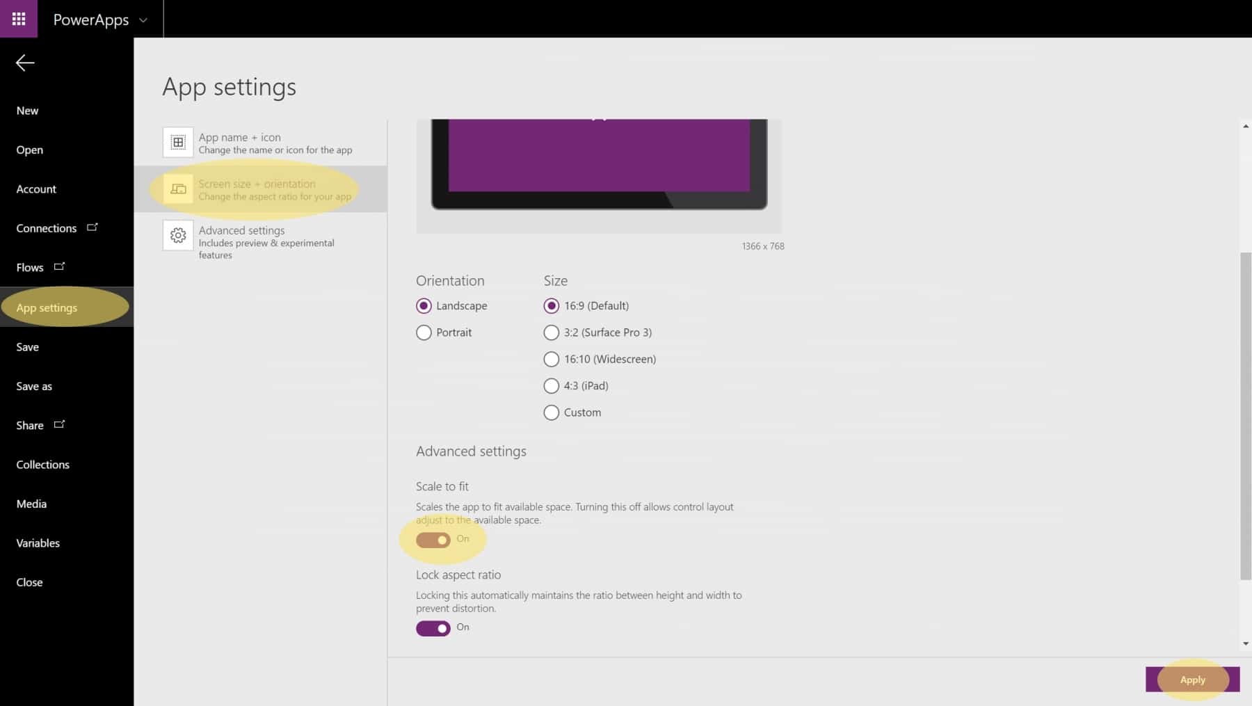
Having created the Power App, navigate to File → App settings → Screen size + orientation and then scroll down to Advanced Settings. Toggle the setting Scale to fit so it’s turned off if it hasn’t been so. That activated the ability to create responsive apps and access those required information. After that, don’t forget to apply your settings by pressing the button Apply in the bottom right corner.
Work with App.Height and App.Width
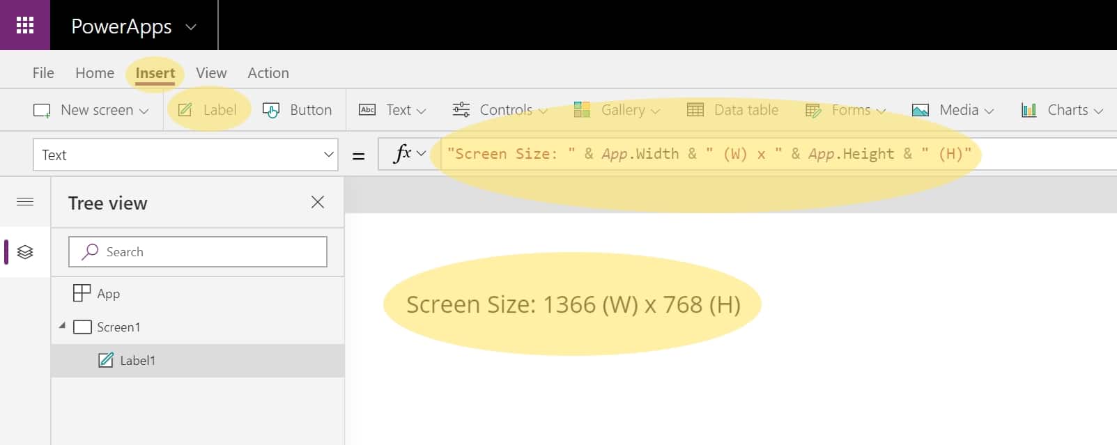
Let’s see how it works with an easy to understand example: First, we can create a a standard label field and edit the text to the following value:
"Screen Size: " & App.Width & " (W) x " & App.Height & " (H)"
Those two parameters return the current width and height of the application which is (by default) 1366 pixels (width) and 768 pixels (height). The default screen size including the orientation and the aspect ratio can be changed in the previously visited app settings page.
I’ll add content within the next days about these specific additional settings:
+ breakpoints / screensize.medium
+ design.height / design.width
+ parent.height / parent.width
Work with Containers
I’ll add content within the next days.
Work with Screen Templates
I’ll add content within the next days.
Publish and test
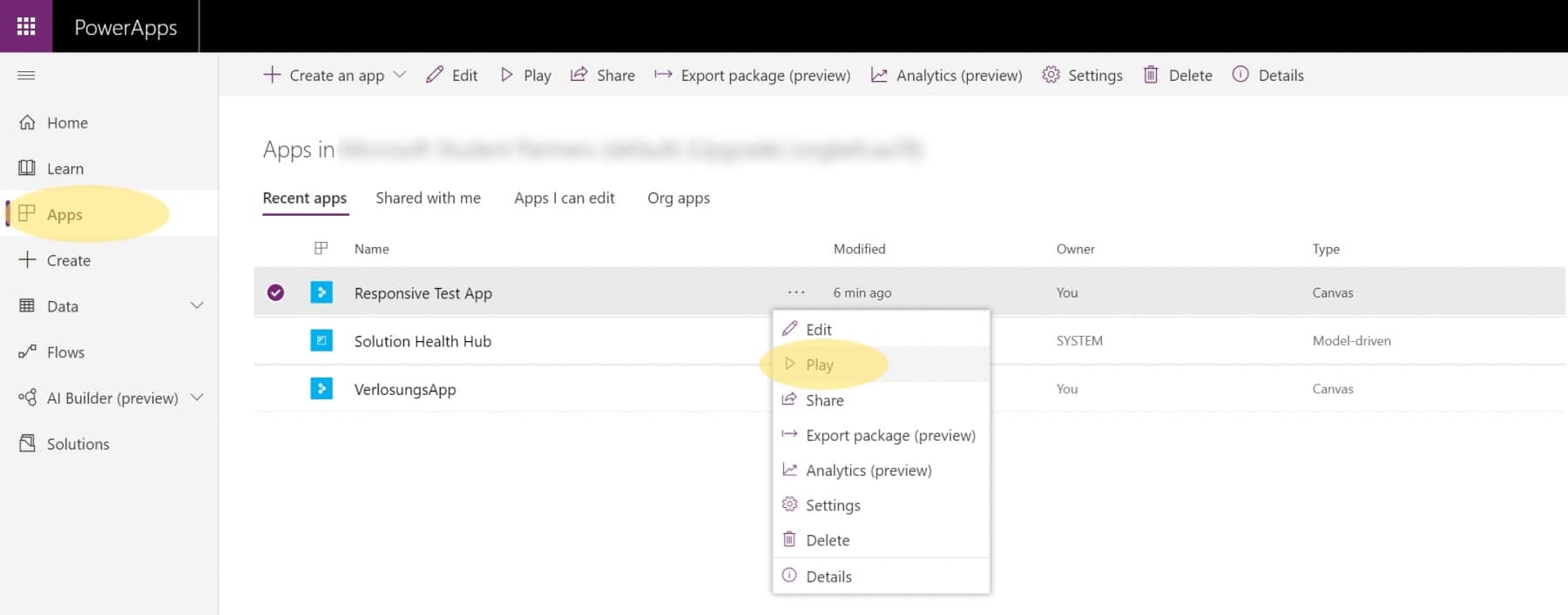
Keep in mind that there are a few things in Power Apps that only work if a Power App is saved and published. This also applies in the case of responsive apps. To do so, navigate to File → Save as and save the Power App by clicking the button Save. And you’re done. In order to see the effect, you have to navigate to your Power Apps and start it from outside the Canvas App Studio. You can do that by opening a new tab click Play on your Power App.
Having startet your Power App, you can see that the label dynamically changes its width and height values based on your internet browser window size or the screen size on phones and tablets.
Examples, Use Cases & Details
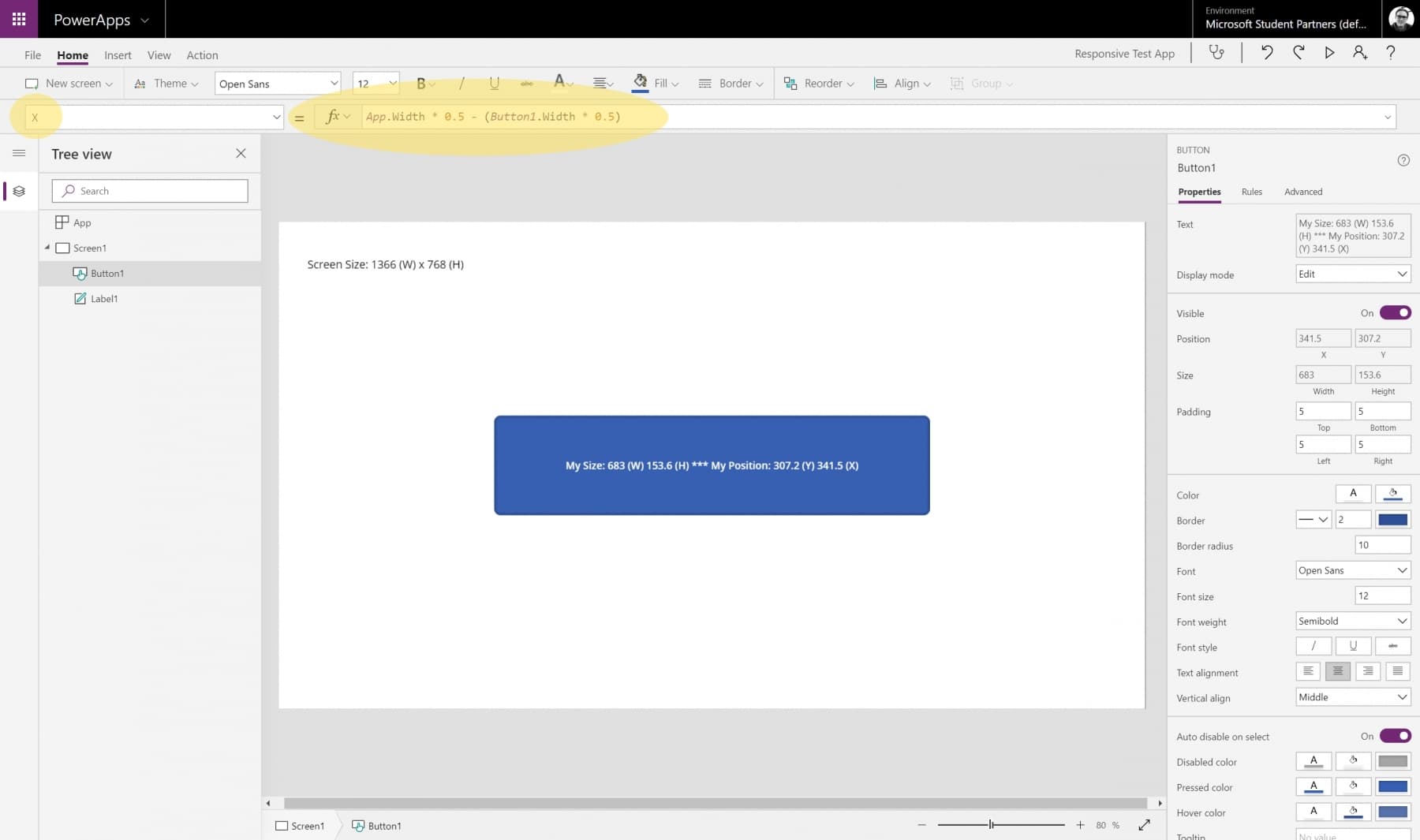
Okay, let’s start with something more exciting and place a button in the Power App and make it responsive. Having inserted an item (in our case the button), you have to consider four properties where to edit in order to achieve full responsivenes:, you have to set the Height and the Width property to its equivalents:
- Height
- Width
- X (Position)
- Y (Position)
Let’s take a look at them and how to apply those properties to the items:
| Property | Value (example) | Result |
|---|---|---|
| Item.Height | App.Height * 0.2 | item has 20% of the height of the Power App |
| Item.Width | App.Width * 0.5 | item has 50% of the width of the Power App |
| Item.X | App.Width * 0.5 – Item.Width * 0.5 | item is centered horizontally |
| Item.Y | App.Height * 0.5 – Item.Height * 0.5 | item is centered vertically |
Always remember to save and publish your Power App in order to see the result.
Let’s have a look how this would look like in real life:
And here are a few pictures of the Power App working probably in different sizes:
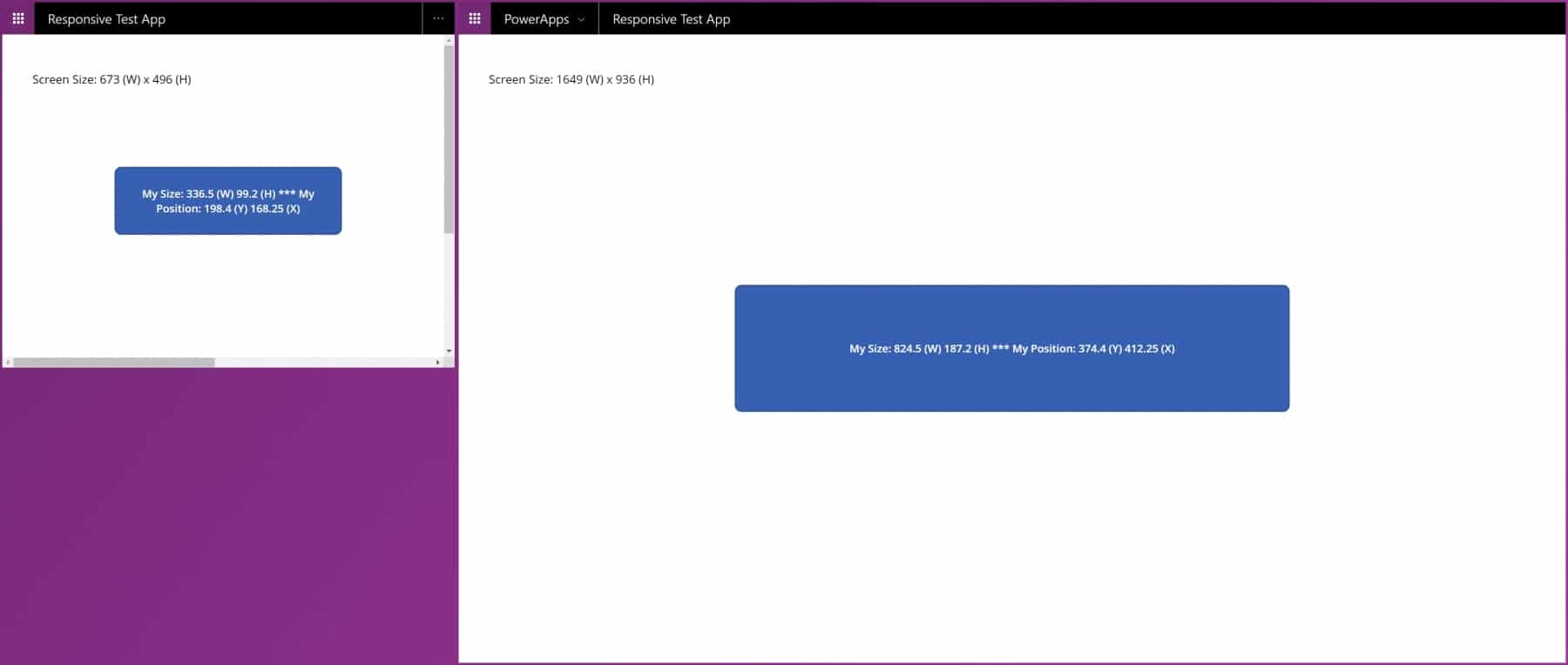
Have a look at those scroll bars which appear if the window is smaller than the minimum screen size. As I mentioned at the beginning, a proper minimum screen size still has to be set.
Please keep in mind: Once you drag and drop an existing item on the canvas, it will automatically chance its position and therefore the X and Y parameters. Power Apps doesn’t keep your responsive settings for the item; it will go back to pixels and it will make that part of your Power App non-responsive anymore. Therefore, my best practice is to first create the desired layout and then use App.Width and App.Height properties to make the Power App responsive.
Additional information on how to continue your journey can be found here:
Questions & Answers
How can I build responsive Canvas Apps?
Make sure to deactivate „Scale to fit“ option in settings. Then, work with App.Width and App.Height as well as other variable formulas to specify positions of controls.
Are Canvas Apps responsive?
By default, no. But you can make them responsive with a few settings and dynamic properties (X, Y, Height, Width) for controls on screens.
 German
  English
Schreibe einen Kommentar